The Prognosis Story (Lite)
--
Design thinking applied to Enterprise Software
I‘ll walk through this case study to expose these two sides:
- Value added for each stage which contributed to a larger project
- Layer in examples of process I’ve found successful throughout
Problem Introduction
IR has been producing On-Premises Software for about thirty years and excelled in helping IT teams monitor the:
- Connectivity of financial institutions (Cards, POS, Terminals, Banks)
- Quality of Unified Communications (Voice, Video, Collaboration)
Shortly after joining IR, I was tasked with designing the cloud platform for what had traditionally been a On-premises product.
Problem arising
As IR’s customers (and industry) matured, they wanted to be more proactive than responding to the last five minutes of data and the only way to see long term trends and perform analytics on them was to invest in very slow and expensive databases that needed full time operators to configure and run. Moreover, there were some analytical functions that were desired but were only available with cloud computing.
Background pressures:
In the background to this growing need, industry research was showing that large enterprises would begin their internal cloud migration of their infrastucture and there was mounting pressure for IR to move to a SaaS subscription model.

Innovation Trifecta
As the Product Management team investigated if a cloud based service would be commercially viable and the Development teams investigated if it was technically feasible, the Experience Design team wanted to validate the problems being reported from field and investigate if there was:
- A problem that was desirable to solve
- A solution that was desirable to use
- A readiness for enterprises to solve it in the cloud
- A willingness to pay for a solution

A running start
Fortunately, we had a head start when it came to research items like recorded interviews, personas, journey maps and empathy maps from our previous UX work in the on-premises space and bespoke cloud offerings. The idea was to offer the solution to the same people with the same problem, just with features only the cloud could offer.
The first steps to check that desirability was:
- Map out what this proactive, analytical journey could be
- Ideate against that journey
- Create and test prototypes
p.s. don’t worry, I’ll circle back to examples of full problem discovery and definition process a bit later on.
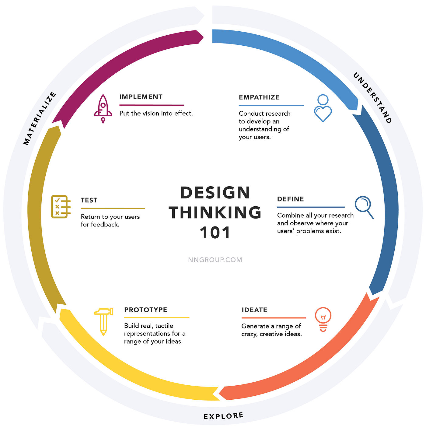
Problem Definition (Understand)
‘Incident Management’ to ‘Problem Management’
I had learnt that our customers were using our product to run the ITIL ‘Incident Management’ process which is a framework that can react to adverse events but they didn’t have enough data to do what is known as ‘Problem Management’ which is an ITIL term for the process of proactively finding the root cause of Incidents and preventing them from happening again.
Journey mapping & Ideation
I educated myself on the ITIL ‘Problem Management’ process so that I could get the outline of a journey map and begin workshops on filling in the detail, ideate against it, cluster the ideas into themes and decide on what could constitute an MVP to test.


Journey mapping and ideation process notes:
I find that out of all the mapping types, Customer Journey Maps capture insight and empathy the best and naturally lead into solid ideation.
- I like to use UX research to form Map outline (Privately)
- Form cross-section team to workshop steps within stages (Early empathy)
- Layer in my own findings/insights and to present to group
- Regroup to ideate against map and cluster ideas into themes
- Use cross-section team to vote on which ideas to progress
Value delivered: Innovative ideas
Once the ideas were added, I led the group in clustering the ideas into themes, deciding a cut off point for an MVP and voting on what ideas we want to progress, providing the business with top ideas to test against the initial points of validation
The top ideas were:
- Affinity Insights
- Conventional “Slicing and Dicing” (charts, tables and dashboards)
- Alerting
- Search
Prototyping (Explore)
Low Fidelity
At this point we only had the ideas in concept but we didn’t have a representation of them within an interface so I ran a crazy 8’s exercise within the design team to strike while the iron was hot with inspiration. It was an ideal exercise to do because we didn’t yet have a design system and were in a position to quickly generate divergent ideas.


High Fidelity
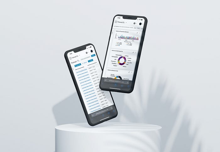
I took the sketches selected and progressed them to high fidelity designs so that we could begin user testing them. IR’s customer summit was approaching and I wanted them to be tested with customers in-person.
At the time we only had low fidelity tools so I successfully campaigned to get Sketch added to the budget (on the first Apple machine) so that I could quickly create well represented, interactive prototypes.

Testing outcomes:
- Found that data had to be accurate otherwise participants would get distracted from commenting on the utility and desirability of idea.
- Idea of delight was very different to enterprise software users e.g. sorting columns within tables was “amazing”.
- Was the first tangible piece that represented a new vision so was also used to circulate internally to build confidence and drum up buy-in for vision.
- Introduced the practice high fidelity prototyping to IR.
Testing Synthesis
While the Design Experience Lead went to the customer summit to conduct testing, I was back in Sydney synthesising the recordings responses regarding desirability, insights, and helping to create a highlight reel.
Testing Results
From the results I helped to present, the business became confident that there was market desire to solve the problem in the cloud that customers would be willing to pay for it. The senior leadership was now keenly looking forward for the PM to put forth some business cases to support the market indications.


Testing outcomes:
- Participants ranked features and added why
- Responses were qualified based on an organisation’s past or upcoming activity. For example, Have you already moved data into the cloud? Do you have a budget approved to solve this problem?
- Avoided “would you like to go to the gym more often” type questions
- Created a compilation of customers response clips to share with business
Value delivered: Customer focused strategy
In the end, Affinity Insights were ranked as the highest priority feature but the close second was the conventional slicing and dicing of table and charts. When participants were asked why they ranked the features this way, the key takeaway uncovered was that although customer loved the insights, they still wanted to go behind the scenes and ‘inspect’ their legitimacy before acting on them.
This information enabled head of Product to generate business cases and come up with a platform strategy to include both with the fundamentals first and then the smarts applied in later releases.


Design System (IR Global Experience Language)
While business cases were being developed, we knew we’d need a baseline of interfaes to support enterprise customers in a cloud platform no matter which direction it took. I ran a content audit exercise with the team to start documenting all the pieces to factor into the platform and this resulted in the decision to start working on a design system.
Initial workshops and buy-in
All components of the on-premises platform and various cloud initiatives were printed to identify what the common basic building blocks of a platform were and then begin to design a unified experience for them all going forward.


Workshop Outcomes:
- Emergence of common platform components (Table, chart, list, CRUD flow, details page, visual alarm, etc)
- Convergence on duplicate components e.g. Unifying five different modal patterns into a single experience
- Desk research to identify outstanding baseline components for Enterprise SaaS products and potential opportunities to delight (Single Sign-on, Audit Logs, Role based access control, Integrations, Team management, Onboarding, Contextual help, Empty states, Sandbox)
- Presentation of findings to business green lit Design System commitment to development roadmap
Implementation of design
Design responsibilities for creating UI patterns were divvied up between the team. Two designers creating the components and the other documenting them into a self service guide.
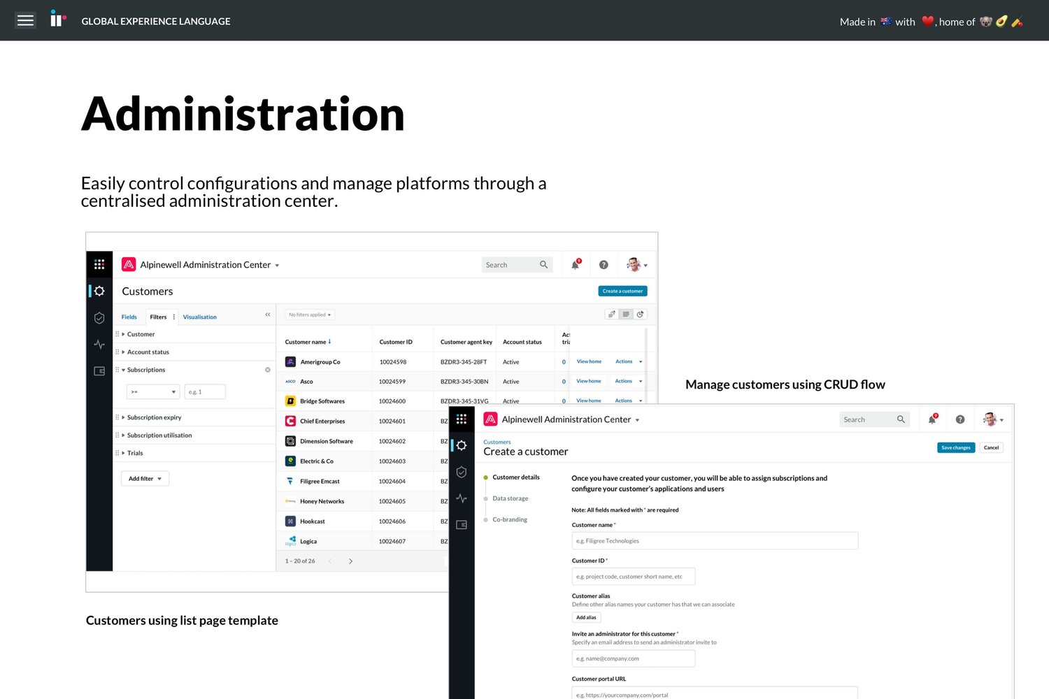


Implementation outcomes:
- Divided work with other UX team members (Others responsible for Typography, Iconography, Tables, Buttons, Sign in, Accessibility, etc).
- Understand requirements from Dev (React library preference).
- Cross-functional effort to apply the IR GEL atop of the Ant Design library to create our own component library stored and managed in Storybook.
- Provided the business with the ability to quickly convert wireframes or white-boarding into accurate product as development teams could self serve UI guidance.
Usability Testing
Although a initial strategy for the platform was still in the works, we knew that our enterprise customers would need these basic operational and system administration capabilities before they could even make use of a specific solution so I started to test those aspects of the application and returned key insights to the business
Value delivered: Insights to form Platform MVP
Even though we had designed many patterns and components in the design library, we knew that seeing them all fully realised was a long term goal and to start with, we’d need to find a cut down version that would still have the right utility and usability for the market.
To make sure I wasn’t over-designing the solution, the plan was to start with a brutally limiting subset of features and iterate up to the point where we stuck the right balance. Here’s the key insights delivered back to the business (what features an MVP had to have) in regards to the testing of the IR GEL.

- Needed to include visualisation (Chartings) for explore so users could understand which way to slice and dice their data next.
- Needed grouping and aggregating data e.g. average transaction amount per store (systematic trends)

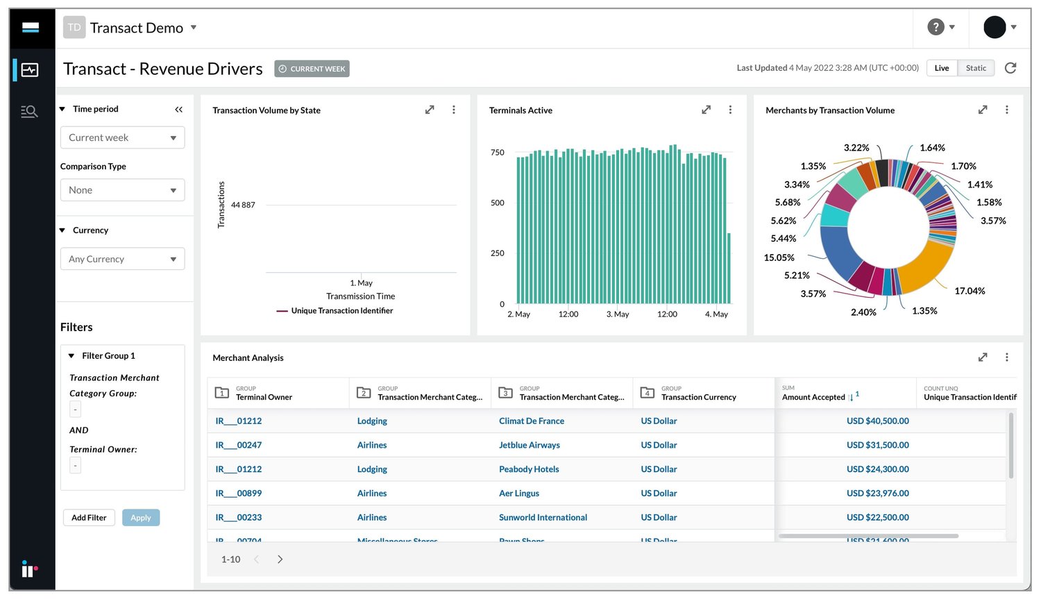
- Originally tested to see if users could perform analytics one investigation at a time but found multiple views needed to be saved to a dashboard to really be able to tell a story.
- Although technical users preferred the aggregation of data in tables, the buyer personas couldn’t understand value without charts and Helpdesk and business users preferred them.

- Needed to re-add visual alarms which served as call to action, meaning that we had to find which metrics where meaningful and assign colour banding to them.
These insights served as critical items to help form the platform MVP and to allow for the the first solution to be built upon it.
Side note: Delight in complex apps
Around this time I really began to understand that what’s probably ‘delightful’ to a user shouldn’t be assumed. I observed users that were more accustomed to on-premises software and even having tables with sortable columns (opposed to fixed reports) or expressing an alert in plain English (as opposed to code) was a big deal. That was certainly a surprise to me, I was used to having to do a lot more to make an impression on users.

General Testing Methodology
While the above is a specific example of a testing round, it’d be good to quickly run through what I tend to go for in when conducting tests.
I like to keep a template of the usability testing for all designers so that we can have trackable metrics over time across all projects
- Summary: Easily look back at test coverage to date
- Objective: Evaluation types per feature e.g. usability of feature X, find-ability of feature Y and/or credibility feature Z.
- Methodology: Documenting items like, duration, timezone, remote/in-person, moderation type, hardware/software requirements and screening requirements so that other colleagues can help book in quality tests.
- Incentives: Give SMEs assurance that they are seen as community leaders, that their knowledge is seen as highly regarded and that their contribution will make a meaningful difference. Financial incentives is not motivating and often times banned.
- Expectation: What the test is/isn’t e.g. not a feedback session and prototypes are not an indication of roadmap
- Priming: Reassurance that they can’t fail the “Test”.
- Metrics: Post-task survey (0–10) to track improvements, Average success rate across all participants to identify weak points, post test survey (NPS) to compare against industry and own NPS
- Outputs: Presentation back to PM of insights and recommendations that should impact or affirm the roadmap priority. Uploading of recordings with automated transcripts.
Plot twists
Twist 1: Strategy Pivot
While the Design System effort was being wrapped up, the SLT came back with approval of a business case proposed to them. Within the ranks, there was a sense that the business would first put a Unified Communications product on top of the platform, but to our surprise, the ROI for the Payments Analytics business case was too strong to refuse.
Moreover, there was API delays with the release of Microsoft’s teams and there was more of a desire for an analytics tool in Payments while Unified Communications were still more focused on troubleshooting which was more in the wheelhouse of the on-premises product (pre-pandemic).
It was the design system’s first real test to see if it’d be flexible enough to accomodate another industry but early applications of Payments use cases gave the business the ability and confidence to pivot on a dime without a negative impact to user experience.
Twist 2: Team changes
During this pivotal time, our Experience Design head and two other UX designers had sought out career changes and/or other opportunities. Progressing the payments solution was reliant on me until I could rebuild the team.
Pivot toward ‘Payments Analytics’
Although a Payments solution shared the same commercial viability and technical feasibility as the UC solution, the users themselves, their needs and use cases were thought to be different.
Partnership Unlocked
As a result of demoing the platform’s user experience alone, ACI (A large merchant processor) stated that they could see how it could enabling a whole new set of users and opportunities for them. ACI signed up to become a partner and began preparations to sell the solution to their customers.
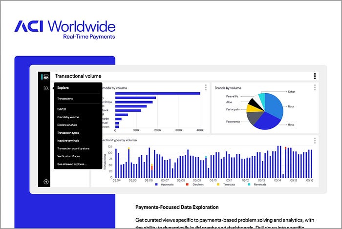
Our global customers are seeking new levels of insight and real-time analysis to help adapt to changing consumer behaviours. By enriching our real-time analytical capabilities through this partnership, retailers will be able to further optimize conversion rates across channels and better orchestrate customer journeys.
John Gessau
Director — Merchant Payment Solutions, ACI Worldwide
Source: Partnership announcement and customer success story
Design Thinking for ‘Payment Analytics’
With this early market validation around the direction, I began up-skilling in the payments domain and and started to outline the outstanding Design Thinking items:
- Empathise: Problem discovery research (interviews for stake holder assumption analysis, why questions, use cases, personas, journey)
- Define: Problem definition activities (Assumptions, root causes, problem statement, Insight presentation)
- Ideate (Parking lots, Divergent, Convergent, Customer workshops)
- Prototype (Using the platform and mock data as dogfood, wireflows)
- Test (tracking improvements over time)
- Implement (User stories, Backlog grooming)
Problem Discovery & Definition (Understand)
Interviews
Through the efforts of PM inviting the viable market players in the ‘Payments Innovation Council’ I scheduled interviews with personnel from large retailers, gas stations and merchant processors. Before speaking to these folks, I put together a discovery team of internal stakeholders and SMEs to run the initial part of the problem discovery and to re-confirm (as was done for UC) that there was still the following:
- Still a problem that was desirable to solve
- Still a solution that was desirable to use
- Still a readiness for enterprises to solve it in the cloud
- Still: a willingness to pay for a solution
In running this problem discovery and definition, I provided the business with the following value
Persona: One amended
I found that it was still a IT professional on both UC and payment sides but with different titles. Both working within the ITIL framework and shared similar skills but with different responsibilities according to their field. One mostly for trends in call quality over times and the other looking for decline rates over time.
In addition, I learned that the IT Pro was responsible for putting together dashboards for Helpdesk (Level 1 support) which meant that we’d have to understand what those people would need so we can make the right out-of-the-box dashboards
Persona: One new
Usually the IT Pro would begrudgingly feild requests from business analyst seeing that the IT pros were the gatekeepers to the data but didn’t want to spend the time sharing it because they didn’t feel like it was a part of their job. The business saw an exciting opportunity because the business analyst is sometimes closer to (or is) the buyer persona so if we can show value to them, sales would be easier.
Value Delivered: Problem statement
There was a mountain of research that I worked through to then synthesise down into a single HMW question so that PM could agree to progress to Ideation phase.
How might we better measure changing payments trends so that we can adapt to change and thus stay competitive and improve our reputation?
Research Methodology Preferences
To better understand how I could get to an outcome like this, it’s important to look at the methodology that I prefer to use in generating the raw research material.
Problem Discovery: Team workshop
To launch into a new project like Payments Analytics, I like to form a discovery team that will help bring forth the stakeholder request, expose it by making explicit the built in assumptions and then conducting research to test the validity of those assumptions.
The request from the stakeholders was that “We need to build a marketplace so that professional services can sell extensions”. Using that request, I ran some assumption challenging for it.

- Assumption: Customers will want to buy extensions from Professional Services.
- Root cause Q: Why don’t customer prefer to buy extensions from another source? (x12 other questions)
- Insight: It’s only through deep trust earned through Professional Services repeatedly saving the day that they can sell anything at all.
- Guidance: The solution should aim to support channels that can simulate the same deep trust but within a cloud experience.
Providing this guidance makes creating estimates for features much easier for developers because they can confidently rule out or explore options because they know what is/isn’t important for the outcome.
Root cause questioning
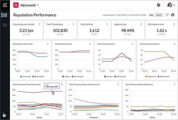
I found it highly important to be asking the right “dumb” questions. It led to insights that start from an operational answer to dig down to the root cause. For example, starting with a request to monitor declines, to then surface a root cause concern around reputation that was later was translated into a focused dashboard solution. I found following this process was especially important if you are in a room of experts and know one wants to looking like they don’t know something.
- Request: We need a dashboard that shows where declines are happening
- Why would you want to track declines?
- Why would you want to fix terminals that are declining?
- Why wouldn’t you want a shoppers to abandon their cart?
- Why would you care if card holders are irritated?
- Root cause: We know that majority of our business comes from word of mouth so we don’t want to tarnish out reputation and risk that business loss.
Root Cause Analysis Outcome:
Asking these “dumb” questions allowed me to design the more targeted ‘Reputation Performance’ dashboard as apposed to a more generic ‘Declines’ dashboard.
Observational Interviewing
I’ve always found asking participants to show me their process results in deep insights even for seemingly straight forward processes. For example of observation a participant might say “I log in” which sounds like one step but when the screen share starts I can see that they have to:
- Log into the remote access client
- Look up the right IP address
- Remember their credentials
- Go through 2 factor authentication
- Confirm they logged into the right place
- Sign out because they realised it was the wrong address
Pretty hard to innovate one summarised step but can definitely find innovation in seeing the actual 10 steps involved.
Ideation (Explore)
Customer workshop
In the case of Payments Analytics, I ran a week long workshop activity with our new ACI partnership, exploring how different use cases would be resolved in the platform. This was an ideal situation because they had access to many more merchant businesses than we had relationships with.
Ideation Outcomes:
Generated 10+ ranked ideas and uncovered some features that would be highly desirable for users which would go on to later influence changes in the roadmap (Default currency, period comparisons, currency formatting, extended data access, etc)

Typical Ideation workshop preferences
- In pandemic by this point so all remote
- Can use a lot of novel workshop formats but important thing is to decouple the people from their ideas (get people to make other people’s ideas better rather than defend the merit of their own)
- Seed laughable ideas for people to build on
- Walk through the material derived from the problem discovery/definition stages (Insights, Problem Statement, Success Metrics)


Prototyping (Explore)
With ideation stage of the product closing up, it was time to prototype the ideas that progressed to this stage.
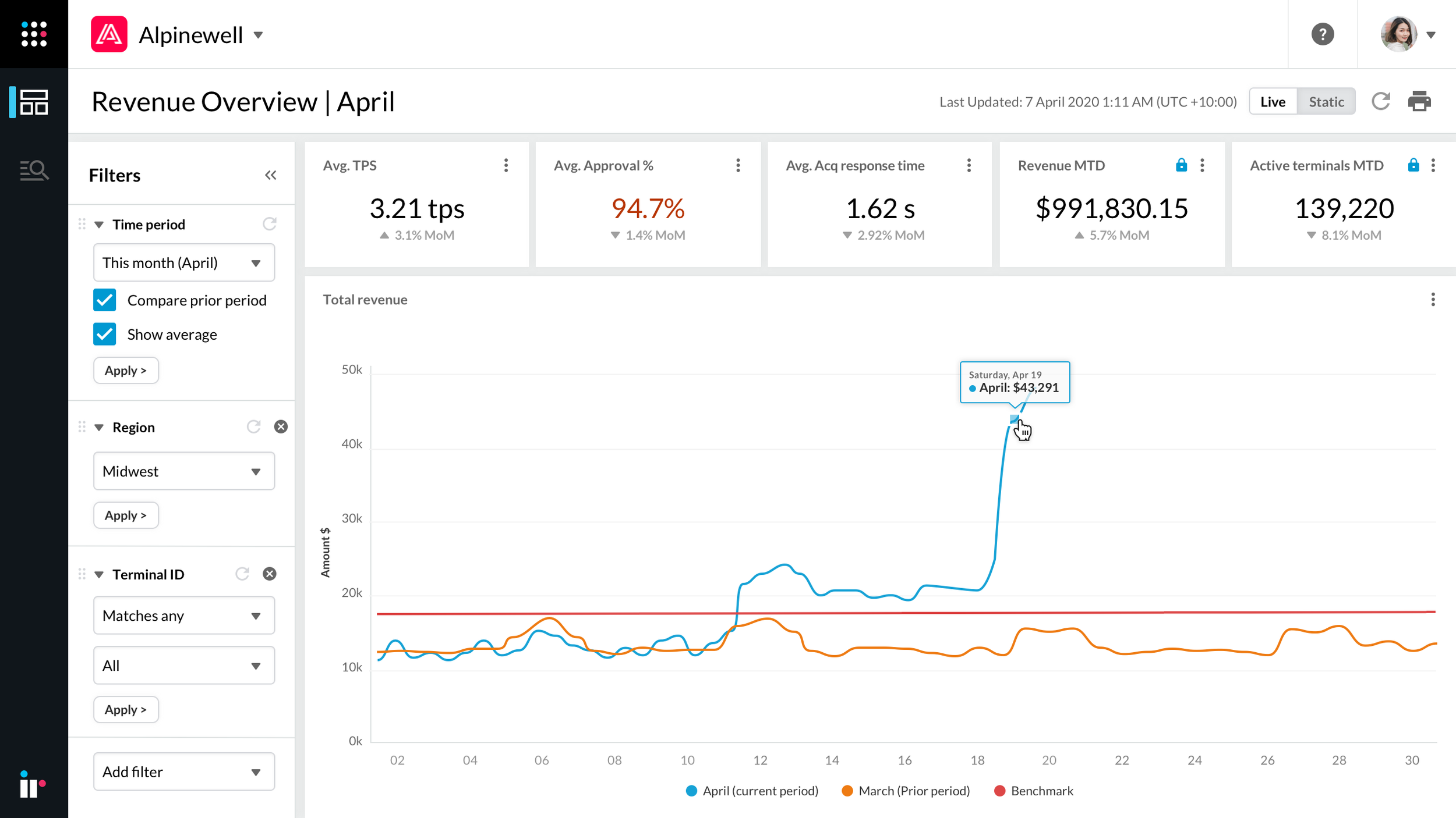
Typically I would make a prototype using prototyping software but in this case, the data need to be realistic and match 1:1 from table to chart (across multiple filter sets) so it was faster to just load dummy data into the newly built platform than it was to painstakingly do data entry within a design tool. Eating our own dog food essentially.

Because the analytics use case was centred around starting from an external prompt, there were actually no screens to create. Instead, I needed to collaborate with R&D to create a mock back-end API that could pull in generated dummy data into the platform. I then worked with the Product Manager to demonstrate testing could be conducted in a dev environment and fine tune a scenario that encapsulated the problem statement
Testing (Materialise)
I created the test plan and put it toward the first five usability testing participants. An overall goal for the testing scenario was determined and as well as the individuals tasks so that I could track where failure points where most commonly occuring and why.
I had a hunch that certain things would be an issue (e.g. unfriendly timestamps) but I didn’t want get into a battle of opinions so just let the test results do the talking. Again, I wanted to start with a minimum feature set to make sure we didn’t bake in more than what was needed in terms of desirability, utility and usability.
Test plan and execution
- Scenario: Merchant notices increase in payment processing costs and finance team cannot account for cost increase so approaches payments analyst to use new tool to find root cause


- Home page: Without navigating away, can you tell me where you think you would find the payments data to begin your task? Can you try to do that now?
- Default Explore: Now that you can see the payment data, without clicking anything on the screen, what do you think you can start doing on this page to complete the task? Can you try to do that now?


- Modified Explore: Now that you’ve found the cause of the processing cost, how would you expect to format that finding for your manager? Can you try to do that now?
- Visualisation: Now that that data has been visualised, how would you expect to share it with your manager? Can you try that now?
- Ran post test NPS and magic wand questionnaire
Testing Outcome:
I found that while participants could find the root cause using the data table, they failed to visualise what they had found into a chart and therefore could not adequately share their findings in a format that others could comprehend.
Value delivered: Insights to form product MVP
I iterated the prototype until repeatable goal success was achieved. Additionally, I ran a post test survey to ask participants to rank order the dashboards generated from the customer workshop based on utility which resulted in using the Revenue Driving and Transaction Troubleshooting uses cases forming the first out-of-the-box dashboards.
Development teams also felt quite confident on what to deliver in the timeframe given the UX deliverables produced so far and being involved in the mock data process.
Team Rebuilding
In parallel to testing the Payments Analytics solution, I was interviewing and onboarding the first UX hire out of an eventual two more that would join.
I ramped the first new hire into team by showing him the design thinking processes I’d just been through and asked him to repeat it for Microsoft Teams on the UC side as the Microsoft Teams API was now available and BT was looking partner with us like ACI had done.
Implementation (Materialise)
From synthesising the results of the testing stage, I produced a list around 20 usability recommendations to reach a successful first release of Payment Analytics including the following which I ranked as highest priority:
1) Pre-configuration
Don’t start with a blank chart and empty parameters. Giving a default state to allow users to reverse engineer controls and then modify them to their needs was far more successful to complete the task


2) Grouping Improvements
Tables are better in helping user recognise the current grouping and the distinction between groups and aggregated values

3) Multiple Categories
Multi-line (Multi-series) charts are better for comparison.


Sprint Involvement
After sharing these recommendations and negotiating their spot on the roadmap, I worked with the dev teams to create user stories for their sprints to get them more familiar with the recommendations. Typically by re-enacting (or recording) what usability issues users ran into which made them quite enthused to solve the problem
Field Collateral
Representations of the implemented solution for sales and product marketing to spark conversations with prospects.
Summary (Overall Outcomes)
- 5 products have been launched on platform so far
- Commercial partnerships formed with successful go-to-market plans
- Continued SLT investment and board approval
- Design thinking now established in offical process
- Culture within team more collaborative, more trusting
- Increased NPS from -40 (First test) to 50 (First release — mixed)
Continued User Experience Effort (WIP)
A project like Payments analytics was greenfield in nature so occupies more upfront time, cost and energy. That being said, since the platform’s launch more rapid features and thus, more rapid run throughs of the design thinking process are now taking place. Here are a few example of that as specific pieces to talk through the process for each.
- Creating alerts
- Default Timezone configuration
- Default Currency configurations
- Service Provider Publishing (Beginnings of Extension Marketplace)
- Period comparison (Corresponding and previous period)
- Managing subscriptions
- Visualising a problem’s owner (EQ360)
- Onboarding (Through TOS)
- Usage analytics and on-screen help (via Pendo)
