Canva Team Challenge: Daisy Chain
Squeezing higher quality, more personalised content out of everyday users.
The Challenge:
Design a single purpose app that allows users to lift objects up and out of a background image.
Primarily this would mean prototyping a companion app for the new Canva app, but also it meant there was an opportunity to explore new tools and re-examine methodologies.
With a two week timeline, the aim was to burn the midnight oil and see what I could design and what I could learn along the way. As usual, it always starts with a problem…
The Problem
We don’t all have the skills, tools or time to deep etch objects out of images like the Adobe Creative Cloud OG and all round graphic guru, Deke McClelland. In fact, almost no one does…
If that’s the case: How can every day people extract objects out of images and then apply them to other backgrounds?

To provide context for this problem, a common user story might look something like this:
As an owner of a boutique perfume store, I want to be able to add my products to an Instagram post so that I can promote my online store.
Constraints
Along with the challenge, there were also some limitations to stick to. The app had to…
- Be an app for iPhone.
- Not be magic (tap to instantly remove background).
- Be clear that it’s related to, but not the same thing as, the Canva for iPhone app.
Ad-Hoc Personas
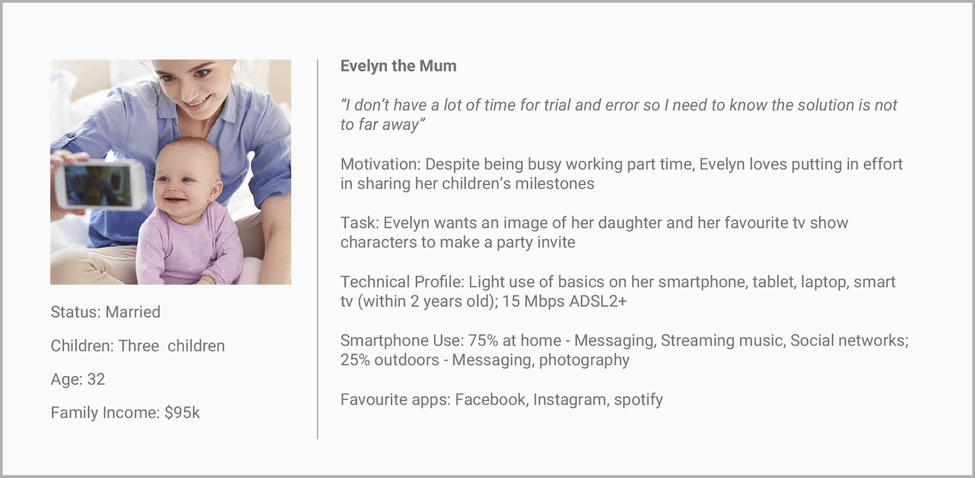
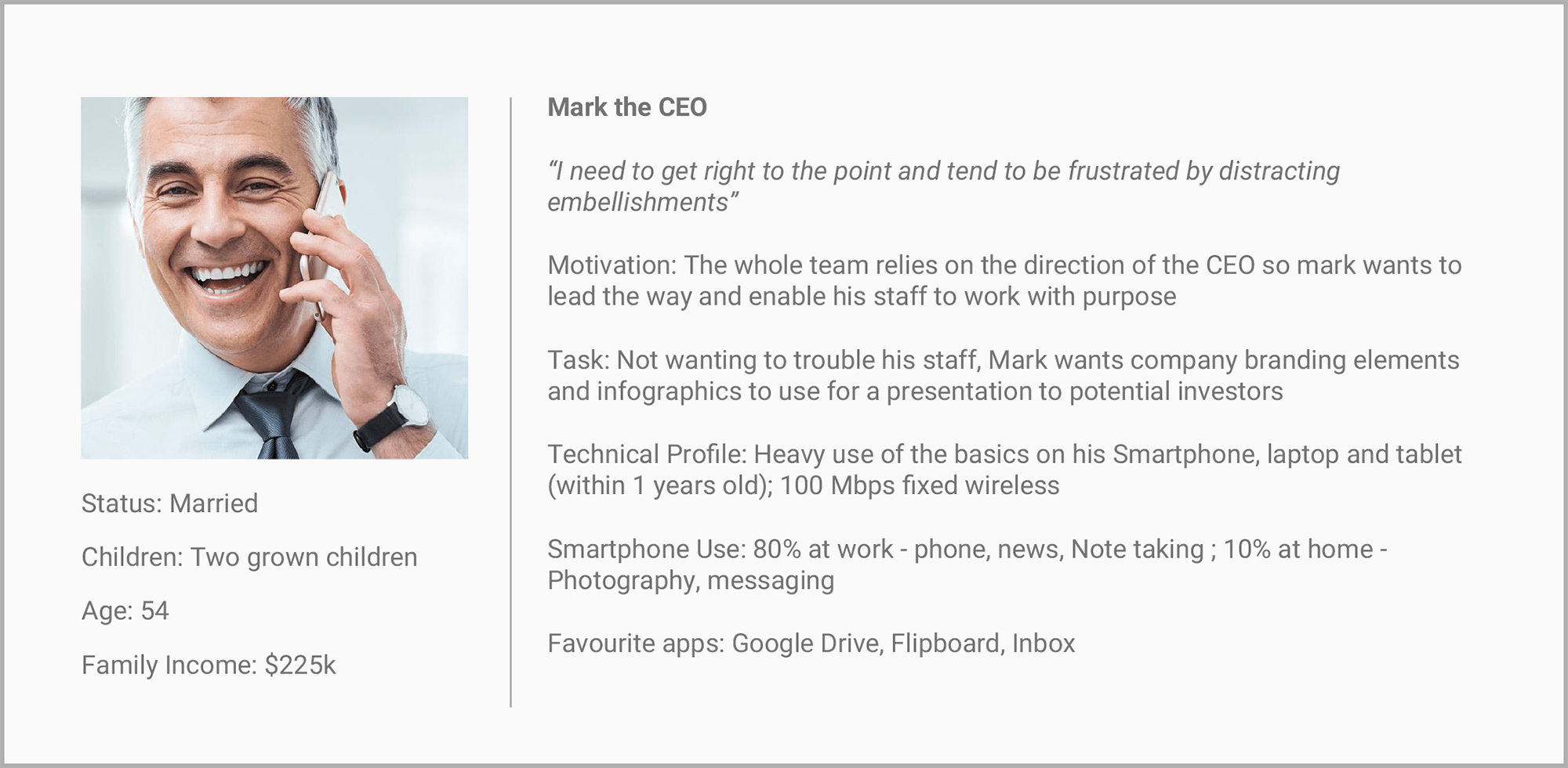
The first thing to do was build some empathy for the user and their needs and so creating personas was the go-to tool for achieving this. Before this could happen, there were some barriers to overcome:
- How do you reflect segments of your user base when there’s no analytics?
- How do you come up with user needs when there are no users?
Unfortunately the answer was, for a large part, you can’t.
To stay aligned with lean UX process and not get bogged down by endless documentation, some intuition (and maybe some dirty hacks) were in order. It’s worth noting that while ad-hoc personas were useful in this case, they’re not free from pitfalls. Adaptive Path put out a great article warning designers to Avoid Half-baked Personas which outlines the importance of making sure ad-hoc or proto-personas “are not an end or even an interim deliverable. They are a phase in a process and should never be used to make design decisions”


The dirty hacks
Not being 100% comfortable on fully relying on my own intuition, I took to google searches, message boards, forums and social media. Essentially, I was searching for people who were asking for help with the same problem I was trying to solve, trying to find out what greater tasks they were trying to achieve and what barriers they were facing.

User needs take-aways
- If you weren’t a photoshop user, there weren’t many options for you. Users needs may be met by offering a service with a low skill entry point.
- If you couldn’t afford to hire an expert, quality results are hard to come by. Users needs may be met by offering a service that is capable of exporting high quality deep etching.
- If you don’t have a lot of time to learn complicated settings, you’re not going to be able to get the results you want. Users needs may be met by offering a product that only offers the most critical levels of control.
Competitive Analysis
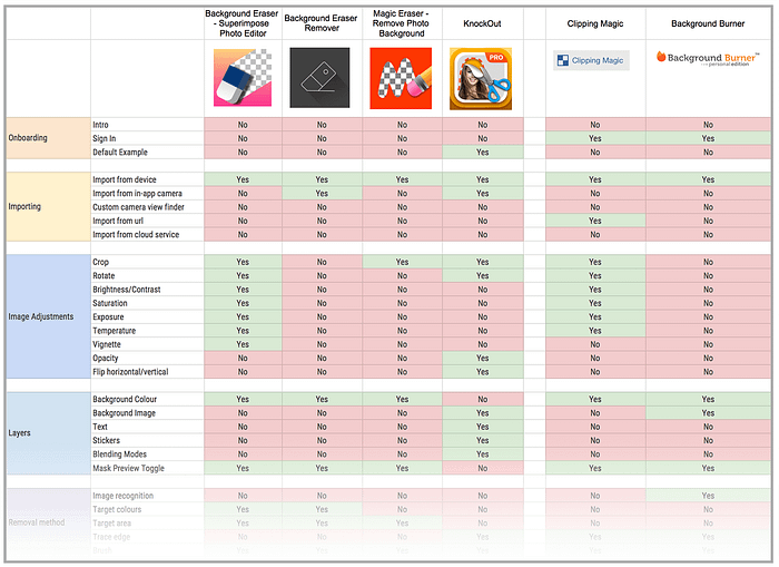
On top of painting a picture of the user needs, it was also important to analyse what the competition was doing. The features of apps and websites that offered assisted deep etching were compared to get a sense of industry standards, popular features and if there were any opportunities the competition were not yet taking advantage of.

Functional requirement take-aways
- No app was offering to educate and delight users about its functions and so having the ability to present an onboarding experience may be an advatage.
- No services were attempting to infer the user’s intent for an image and so users may appreciate the service of computer vision to try and extract objects for them.
- All services with a camera function were using the standard view finder and so users may benefit from a custom view finder that guides them into taking photographs that more easily deep etched.
- All apps were propped up by obtrusive ads or paid subscriptions and so users may be drawn to the only fully free service.
Experience Mapping
The users needs and the functional requirements were starting to take shape but there was still a bit more to consider in terms of the whole process from sourcing an image to inserting a graphic into the Canva app.
Without the luxury of a big boardroom to plaster sticky notes across, the hunt for a virtual alternative began. A few folks were recommending Trello but the primary need was to find something more similar to a standard customer journey map so I finally settled on StoriesOnBoard. This tool allowed for the division of notes horizontally into the different types of experiences that the user would face during each stage of the process e.g. doing, thinking and feeling.

This exercise kept the user-centred design process a priority but also, it was a great tool to draw out more ideas that wouldn’t of come about by only thinking of the experience within the app.
Top Insights
- There’s a significant amount of research before the user even opens the app, help to eliminate these low points by allowing users to source images from within the app.
- Images captured via an in-app camera may be taken in bad conditions, give the user suggestions within their camera view finder as they shoot.
- Users have many concerns during a project’s research phase. Investigate becoming involved in early stages of the experience by utlising external blog posts addressing concerns.
Success Metrics
Despite knowing that the project would likely not be handed over to a developer, the aim of the challenge was to cover all the bases. In this case it meant ensuring that the functional requirements for recording the right analytics would be built into the app.
How will we know if the app is a success?
We must be able to measure if:
- The amount of Canva sign ups vs. abandonment at over 85%
- 30% of sign ups open the app at least once a month after first 90 days
- ⅓ of users export graphics into Canva to use in their layouts
- The user can complete task in under 3 minutes
- The AppStore reviews are 4 stars or higher
- The background removal requests made on canva.com go down by 75%
Sketching
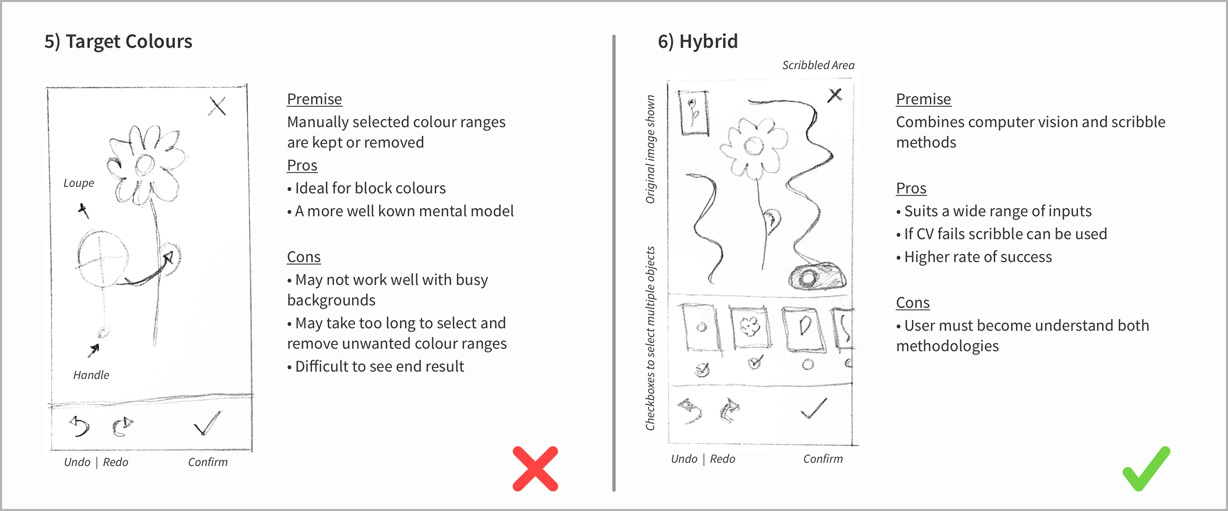
At this point, a list of features for the MVP was set but the infrastructure that would afford users the ability to interface with those features did not yet exist. For the deep etching portion of the app especially, there were a lot of ideas about what could work. But in reality, those ideas would need to be sketched out and compared side by side before I could see why most of them were actually pretty terrible.
It’s chaotic, it’s ugly, but it works.


Ditched Ideas
- Filters: although simple for the user, they didn’t offer enough flexibility.
- Computer vision: may return too many false positives when used on its own.
- Shape masks: Not refined enough to cover photographic input types.
- Scribbling: Although the most common method, using finger blocks view.
- Target colours: takes too long to deep etch inputs with a wide spectrum of colour.
Winning Idea
Going through all these failures forced a new solution to float to the surface. That is, by combining the computer vision and scribble methods, a quicker and more simple method was realised. Although there were weaknesses with scribbling, it was still the most common mental model and the first step was inferring what the user wanted so it was possible that the user wouldn’t even need to scribble at all.
Wireframes: the devil is in the detail
Usually putting together wireframes is an essential document to resolve issues with or discuss the hierarchy, page structure and content of a design with your team and/or client. In this case it was just me but that didn’t mean that the process was without its uses.

Content Audit
Apart from those fundamental uses, it was also an essential tool in creating a list of items required to develop the prototype, things like:
- Graphics for the onboarding slides
- Logos and iconography
- Micro-copy
- Stock images
Technical Assumptions
It also challenged some technical assumptions that needed confirmation, such as:
- Can we deep link to the iPhone’s privacy settings from the app?
- Can we use a Canva account to login with Daisy Chain?
- Can we use Facebook and/or Google to sign up new users?
Prototyping
A fundamental aspect of taking this challenge on was to explore new technologies and the prototyping stage ended up becoming the biggest part of that. I had used the trial of Daniel Hooper’s Principle a few months beforehand and was impressed enough just to buy the thing and find a way to use it. The below prototype was the first project in line.
Micro-copy and onboarding content
Because principle took care of complicated interaction and motion designs so well, I was able to produce the bulk of a fairly high fidelity prototype over a few nights. Having the prototyping out of the way, more time could be invested in the micro-copy and and onboarding content, hopefully to make a more engaging experience.
Download the prototype
I’ve made the working file available for download! See how I put the Principle file together and explore all of the interactions not included in the run through video.
Download link in my Dribbble shot here:
Interested in seeing more? Visit my website for other works and profiles (:
